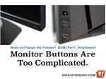
Monitors Should Have Dedicated Buttons for Input, Volume, Brightness

By
Staten Island, NY Posted: 11/12/2014 1:00:00 AM
Remember when TVs and monitors had lots of buttons and dials to adjust things like volume, brightness, and tint? Now, they don't even label the buttons, because they use the same buttons for everything.
Back in the days before remote control, TVs needed lots of buttons and dials. As remotes became popular, they eventually stopped putting those adjustments on the TV, so they started scaling back the buttons and dials on the TV, after all, you never get off your sofa to change the channel or adjust the volume.
For the rare case where you can't find the remote to adjust those settings, or select another input (HDMI, Component, etc), they put a few unlabeled buttons on the side, along with a series of on-screen menus that are nearly impossible to navigate. For what it's worth, since everyone clings to their remote like a chimp to a banana, I admit they rarely need to touch those buttons. I'd even say a lot of people don't even know where the power button is on their own TV.
The trouble is, as they started to remove these buttons from TVs, they also removed them from monitors, which sit only a foot away from you on your desk. They have no remote, so you're stuck trying to make adjustments with those buttons. I can't count the number of times I poke around trying to simply adjust the volume or change from DVI to HMDI and I end up wasting several minutes trying to do what should take seconds.
I remember reading a post on an Apple blog where somebody asked how they could adjust the brightness on their $1000 Apple Cinema Display. Instead of a simple answer, there were at least 24 replies with steps that included downloading different Windows 64 bit drivers, burning pirated software and alternate USB cabling configurations. All this fuss to change the brightness? Why not have a button or dial that says "Brightness"?
Yes, buttons and dials cost a few extra dollars, but because there is no remote, these unlabeled buttons are not suitable for desktop monitors. If keeping the button count / cost low is an issue, at least make better buttons and re-consider a dial or two. Think about the original iPod, which did most of it's navigation with a simple dial and one button.
Personally, I think volume should be a dial, but if you must use buttons, then at least put dedicated volume buttons someplace on the opposite side, so you don't get them mixed up or have to mess around with menus and mode buttons to adjust it.
 Joe Crescenzi, Founder
Related Media:

(Reply N/A) (Edit Topic N/A)
(Like Topic N/A) [0 ] 7928 Views
Related Posts
Accessories(2)Monitors(3)Rants(99)Technology(90)
Top 25 Posts
* Note: The ideas on "Idea of the Day" were posted without any formal research into existing inventions.
In some cases, patents may already exist for these ideas, in other cases, there may not be any existing patents and you are free to develop and explore the viability of developing and patenting the ideas.
The authors make no claim that any of the ideas are safe, practical, or suitable for any particular purpose. You are responsible for the results of trying, developing, patenting or using any of the ideas on this site.
For some people, our ideas are just an interesting read, but our goal is to encourage you to take action. If you see an idea that you like, do something with it... Take action.
- Joe
 on...
on...